Getting Informed about Infographics
At Earthen Lamp we love a well-designed infographic, that uses datasets effectively to tell a story and make an impact. We thought we would put together what we know into a short guide for those thinking of using infographics in the future.
Why and when to use an infographic?
For some reading and understanding long paragraphs of text or tables of data can be challenging – the brain tends to switch off quickly (especially when scanning an article on a screen or device). Including infographics will allow the brain to capture and understand a lot of information more quickly.
A good infographic needs to have a simple structure, be visually appealing and presented in a way that’s easy to follow and informative, allowing the reader to absorb and understand the information presented.
Creating your infographic
Choose whether you wish (and have budget) to work with a designer or whether you are going to create the infographic yourself. If you are going to use the infographic as part of a funding bid or to demonstrate your impact to future stakeholders working with a designer to create something that works well will be an investment. Choose a designer with experience of creating infographics and look at examples of previous work. If you are creating the infographic yourself Canva has some ready-made templates which could be adapted for your needs.
Round up your data and write your brief
Think about the story you want your infographic(s) to tell and how you want to communicate this story. Bring together your data and develop a detailed brief of what you want, including how you plan to use the infographic, the intended audiences and what formats you require. Think about your branding and in-house style – you want your infographic to reflect your organisation. The more information you can share with your designer the better the outcome.
Be selective with the data you wish to include, trying to squeeze in too much will lessen the impact. Decide the key points you wish to emphasise and share this with your designer.
Test your infographic
Gather feedback from your potential infographic audience by testing it out with people outside of your organisation. Can they understand what it means and the story it tell? Does it have the desired impact? Is anything confusing?
Looking for inspiration?
The 10 Commandments of Typography
This shows how to bring a range of information together, to make an impact when juxtaposed in a certain way. An effective infographic makes the reader feel like an expert allowing them to know exactly what they need to know in a short space of time.
Infographic of Infographics
A good infographic allows the eye the ability to move around the page with ease. You don’t need to always look from left to right or from top to bottom, it’s a document that flows seamlessly between sections and draws you in. It gives the reader the choice to read the parts which stand out to them, whilst still understanding the context of the wider information.
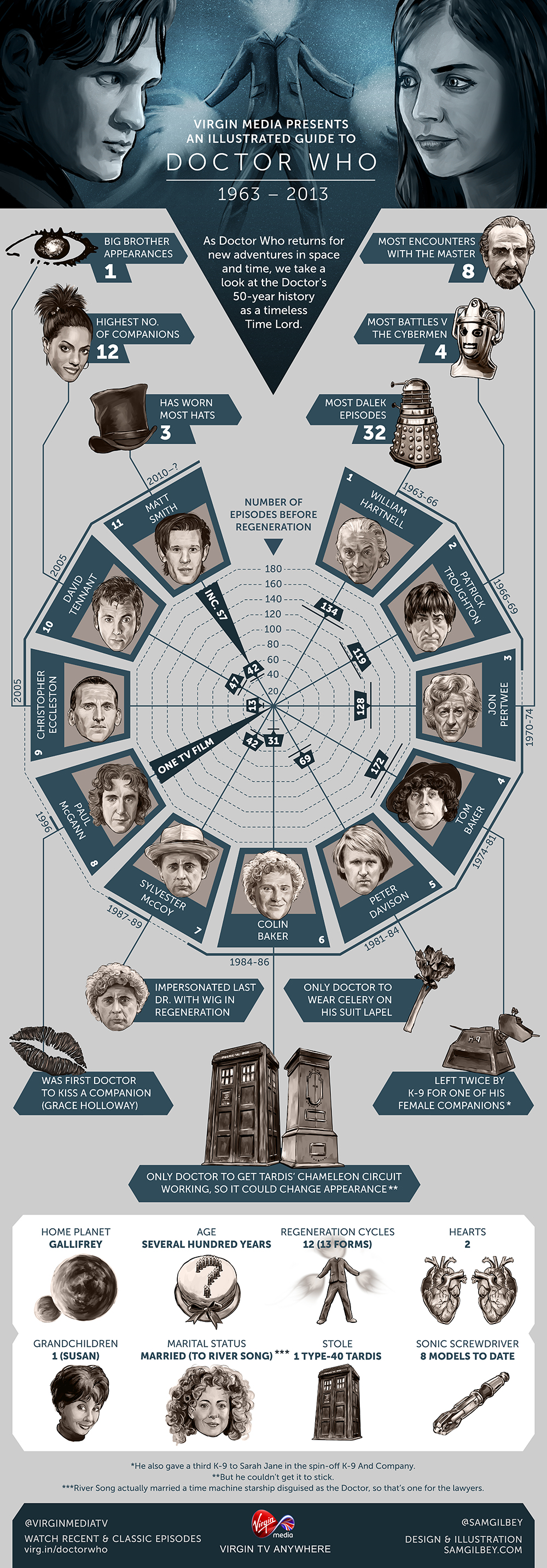
Here are two examples of pop culture: Fifty Years Of Doctor Who (illustrated by Sam Gilbey) and Avengers Assemble (designed by Lemonly) Both have a very different approach but capture the feel perfectly. The reader is allowed to dictate where they look, how they know all they need to know immediately.
Additional resources you may find useful:
15 easy steps to design an infographic from scratch
40 of the best infographics to inspire you